As an Amazon Associate, Modded gets commissions for purchases made through links in this post.
When you buy a new car, you expect all the buttons and touchscreens to work. After all, you’re paying enough for the vehicle. What if there were gadgets the manufacturer never intended to set up? This automotive trend has a nickname — poverty buttons. They can make your car look empty, but there are reasons for them. Here’s what you need to know about these buttons.
What Are Poverty Buttons?

If you press the poverty buttons, nothing will happen. Don’t worry — nothing is broken in your car or its dashboard. This function is intentionally powerless because of the manufacturer’s setup. The automaker could’ve put the buttons there for fun or because the model is different in your country.
Pressing a poverty button can be frustrating if the result is anticlimactic. Your curiosity could make you wonder what happens to your car after touching the mechanism. While some manufacturers leave it to the imagination, some people are frustrated with these buttons.
Why Are Poverty Buttons Becoming a Trend in New Cars?
A social media user bought a 2023 Hyundai Hyundai Santa Fe and encountered poverty buttons in his car. The car buyer pushed the prompt to control the heating and AC, but nothing happened. Why did the car fail to do the command?
Hyundai likely left the buttons blank because the features aren’t ready yet. Alternatively, you may find the space blank in your car because it’s only available for the more expensive trims. That said, you could still encounter trouble if your vehicle differs from the automaker’s original country.
For example, suppose you’re a college student driving a Lexus IS 250 to school. If you’re in the European Union, your car must have rear fog lights to comply with the governing body’s regulations. American cars are less likely to have them, but Lexus won’t change the car just for the U.S. — they’ll instead leave a poverty button.
Poverty buttons are becoming a trend because automakers aim to maximize cost-cutting measures. The past four years have left executives looking for ways to strengthen their bottom line, so a streamlined design helps them achieve this goal.
What Are Examples of Poverty Buttons?
While poverty buttons seem inconvenient, you can have fun with them. Some car owners and designers have toyed with their cars to make them unique. What are some of the best examples? Here’s a rundown of the most fun gearheads have had with them.
Rocket Launchers
Missile vehicles are typically only in the military and movie sectors of cars. That said, you can still have fun with rocket launchers on your poverty buttons. Draw rockets on your poverty buttons or detail a logo to indicate your car means business — even if the function is useless.
With a rocket launcher button, you could launch yourself into the Cyberpunk universe by mimicking the in-game vehicles. For example, the Thorton Galena Locust is among the most popular weaponized cars that fans use.
Seat Ejectors
Imagine driving on a road trip with somebody who starts to get on your nerves. Despite the 12-hour journey, they won’t stop running their mouth and complaining. Have you met these people in your life? Having seat ejectors would be one solution to this problem.
The eject button is a popular function across video games in cinema, whether you play GTA 5 or watch the James Bond movies. 007’s Aston Martin DB5 was tricked out with an ejector seat whenever he needed to escape trouble.
Thrusters
Another fun poverty button idea is to design them as thrusters. In popular media, this function transforms your car from a regular sedan into a rocket. With one touch, you’d drive faster than a NASCAR driver on their way to win the Daytona 500. Design a thruster symbol on your poverty buttons for a fun design idea.
While primarily in film, rocket thrusters may have inserted themselves into real life. Tesla CEO Elon Musk has said the revamped Roadster can reach 60 mph in less than one second, staking a bold claim. Will it come to fruition? That remains to be seen — for now, draw a rocket on the poverty button.
What Automakers Install Poverty Buttons in Their Cars?
If you see a poverty button, it’s more likely to be in a newer vehicle. Which automakers can you find one of these mechanisms? Here are a few examples, ranging from luxury vehicles to everyday cars.
Alfa Romeo

Alfa Romeo is one of the oldest luxury automakers worldwide, producing Italian sports cars for dedicated gearheads. However, it’s not devoid of poverty buttons despite the high price tags. Some of the newest models have blank spaces where you may expect specific functions.
For example, check out the Alfa Romeo Giulia. This luxury sedan is one of the top vehicles on the market, but it has a poverty button on the dash. The most likely reason for its placement is symmetric design. The left side has two workable buttons, so placing only one on the right would feel wrong. However, only one of them actually works.
Mazda 5
Mazda is a more affordable automaker with poverty buttons on the dash. Use the Mazda 5 as an example because it’s a popular vehicle worldwide. You may know it as the Mazda Premacy or the Ford Ixion because of its many renditions over the years. Regardless, you may find a poverty button.
If you have a Mazda 5, check the bottom of your dash because there are likely some blank buttons. One reason for this difference is the U.S. and international markets. If you bought a Mazda 5 overseas, your vehicle could have a button controlling the side doors and trunk. However, these features aren’t in the American version, leaving a blank.
Honda

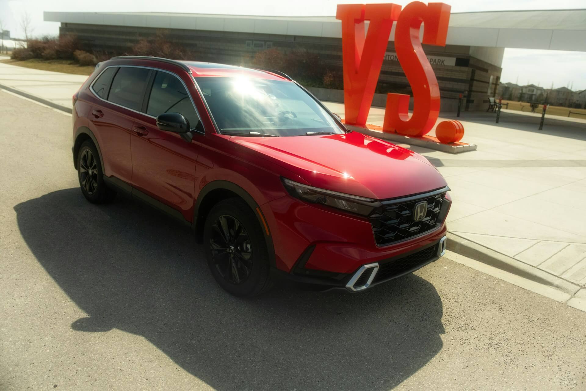
Honda is a prominent automaker because of its safety and affordability. After all, the Japanese manufacturer regularly ranks among the most reliable cars when experts scrutinize the machines. So, why do they put poverty buttons in the CR-V?
If you drive this SUV, you probably know what we mean. The vehicle has multiple buttons to aid traction control and open the trunk. However, there are four more with no functions. Why did Honda waste the space? Even the upgraded trims have a few empty buttons across the dash. Again, there are likely some discrepancies with the European trims.
Making Sense of Your New Car
Buying a new car is a fantastic experience, especially if your previous vehicle is over a decade old. You’re practically in a new world with your new whip!
While exploring the car, you may encounter confusion because of blank spots on the dash. Don’t fear these poverty buttons because they’re useless. While the manufacturer may have an explanation, the car could have them purely for design purposes.


